
Brian Bolland's terrific cover for Jack of Fables #28. I love those boxers! I'm sure I've worn boxers just like that. Seriously; shirt, tie, jacket, boxers.
 UNIFORM DESIGN FOR THE TOWER GUARDS
seeing all the designations and rankings of the Golden Bough Librarians in this arc prompted me to finally make an attempt to design distinct looks for different units.
I know, I KNOW! There's an entire Western that hasn't been posted.
Also, House of Mystery #10 happened. (Have I posted that?)
Hey, All! Happy Holidays and Welcome to the Blogger.com commentary for JACK OF FABLES Issue Number Twenty-eight,"The Book of Leadership: The Books of War, Volume One".
The Writers, of course, are Matthew Sturges and Bill Willingham...Jose' Marzan, late of Y The Last Man, did a beautiful job on the inks. This is his first time inking me as Andrew, my regular inker ...I won't say "normal" inker since there's nothing "normal" about him, Andrew Pepoy is off inking Bucky on FABLES.
I read in the Chicago Tribune last week, FABLES is being looked at as a television series on a major network. That's pretty cool.
I always saw FABLES as a cable show myself, like Dexter or Weeds, considering the mature content of the series.
Masterful Todd "The Kerning Fiend" Klein busted out the letters, Danny Vozzo was in charge of colors, the Freakin' Awesome Brian Bolland wowed us with that cover (we've got to get that up here) and Angela "DO IT LIVE!" Rufino kept us all from losing our collective heads.
Here's the break for Page 1.

So, as I understand it, shit goes all Bosnian in this arc. Which is all well and fine considering the topography around the GB Camp; Serbs(Bookburner's hoards) high, besieged townsfolk (Fablekind)low in the valley catching hell. The Serbs were high, right? The Serbs seem to be the high ones...
I clearly have a sense of the camp being nestled in a valley. Bill suggested that way back and who am I to argue?
Russ sort of established a flat plain on the approach to the camp.
But I think the sloping ground, which helps impede any speedy rush past the perimeter fences and the guard towers, also serves as a tricky and dramatic place to have an epic battle.
An epic battle in 3 feet of snow. Saved me from having to draw a lot of feet and legs below the knees for teeming combatants. Plus I find corpse-garnishing more evocative and poignant in snow, "Is...is that a...pancreas?"
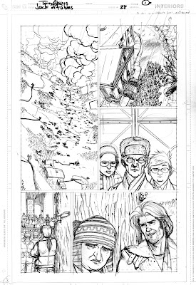 I've said it before, nothing beats being the artist on this series. There's a squirrel in pants on the trunk of that tree!
A shirt would have not been as funny.
Just the pants, though? That's hilarious. They're "high-water" pants, too. Because the shit the inmates find themselves in gets really deep!

This is a very "REDS" scene; Revise addressing the gathered forces as they prepare to repel Bookburners' attack.
I kept thinking as I drew this,"I'm gonna kill my inker."
Turns out he was stronger than I thought.
Next time...
Note that the people you see standing next to Revise on the steps of the Main Library are actually established characters.
Those are the other Senior Librarians. We see the Page sisters all the time, but these are the "paper-hangers" that do the boring shit. Important shit, but still boring. I'm sure they love it.
Remember that chart Sam made way back in the Escape arc? That's where we see these guys for the only other time before now. Bill and Matt named them and everything.
I think Walter Chang and Bethany Brown are kickin' it on the side.
I love Jerry Amsterdam, the big guy in the expensive and impractical outdoor gear.
He's going moose-milking...He tracks a bull moose and then presents himself in full view; the moose takes one look and shoots milk from it's nose.
Man, Todd was able to really compress all that dialogue into a neat column on page two. I had expected that the balloon spread would run to horizontal across the two pages and t-bone into the title/credit box. But even that's been put on page two.
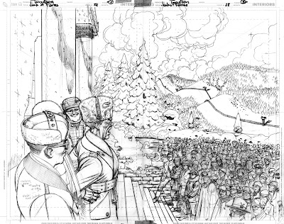
You can see the Bookburner's army emerging from the treeline.
They sure are finding a lot of stuff to burn out there. This spread made me anxious; all the Librarians. There's some special-ops guys (Hey, Oppy!) and then some plain old grunt types, like Ted who we see in that winter poncho. Gertrude next to him with a Bagman satchel for deployment.
Fablekind lurking to the back of the crowd to keep from appearing too willing to buy what Revise is laying down...

Here we see where the Editors checked my bad (yet, oh so very good)intentions to have too similar a layout over two sequential pages; Pages 4 and 5 have the large vertical panel with a triple tier to the immediate right. I simply liked the similar rhythm of the layout and the efficacy of the panel sizes. Little neat sizes. Sometimes there's an action written in a panel, and if there's only four panels on the page I feel like I'm wasting space. So I take it upon myself as "the Director" of this paper movie to pad out the scene by adding an extra panel. That's not the case here...I'm flapping my lips. The wider shot, requested by Editorial, at the top of Page 4 came out nice.
Pick your battles, is what I'm saying. Editors who do their job well will ask you for changes and Angela and Shelly ask for a shitload of changes! I'm joking, of course. They rarely ask me for changes.
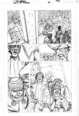
Pick your battles, seriously...
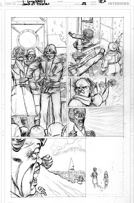
Bill and Matt, in Panel 2 of Page 6, wanted to have everything come to life as Gary loses it at Revise...Considering that it was just a single panel on a five panel page and I had already drawn 500 or so personnel prior and was about to draw another 500,000 or more for the issue in related battle scenes, I went very, VERY wide for the shot in panel 2.

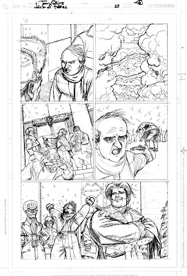
Here's another change in panel 5 of page 6; I was asked to pull out wider on Jack to give him more of a heroic shot. The whole action where Revise tosses Jack from the top of the stairs was something I added for comic effect. I thought that maybe having the reader see Jack in the act of picking himself up from the pavement as Gary spoke so highly of Jack's exploits to the crowd and having Jack finally come back into shot as the crowd went apeshit...and he being clueless to the applause being for him...we'll change that in the trades.
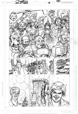

I'm really regretting the blacks indicated for the shadows of the Guard Towers and fences. Something more in the line of a grey-blue40% would have been better. The weight of the shadows is beating the shit out of the page.
Akins, you're fired!

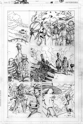 God I hate that camel. Could there be a more difficult animal to anthropomorph and clothe? OK, a crab maybe. I always feel like I'm drawing Joe Camel and forcing children to smoke. Maybe because as far as I can go back in my previous life as an advertising artist I refused to accept or execute work for tobacco clients. That camel is saying 'tobacco' to me!
Here comes Paul Bunyan's big ax...
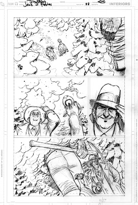 ...and there it goes!
 If film is the medium of compromise, as the Warshawski Brothers put it, that would make comics the medium of casual omission: where do we think the back pockets and signature bandana went on Paul?
Bill is waving at me frantically, "You're not supposed to call attention to the things you screw up! So we can fix it in the trades before anyone notices you're a complete idiot!"
Too late my friend, aha, ha ha...too, too late.
 Chicken Little's nurse uniform is indeed PVC. Jealous?
Late in the game is usually when the requests for little changes come in. Panel 4 of Page 11 needed to have Robin in shot just a wee bit more so she could say something...


... I use these opportunities to practice my inking. Which needs a lot of practice.
I think I should really follow through more on color notes. I'm always surprised at Hillary's hair. The two-tone thing is finally getting through, but I see her with green bangs and a bleached head of hair frosted at the tips in hot pink. Really.
The model for Hillary is real. I was on the Brown Line headed to the studio one day and 'boom' Hillary gets on the car I'm riding in. No lie.

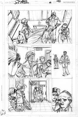
Yeah! Here we go! CRIME!
Matt and Bill had Pris slugging the guy in the boxers and gently easing him down on the sofa. Space and time necessitated me having her dropping his ass to the carpet.
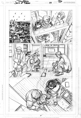
Panel 2 on Page 14 was tricky because of the shot and tightness that Angela wanted on Kevin's face plus seeing the danged box and pen...plus, Priscilla simply has a huge rack. I had to cheat her bosom way down. That's nothing sexist, that's just how I built her character.

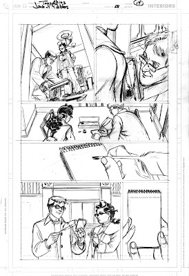
Love the last panel on Page 15.

I can't believe I got away with this!

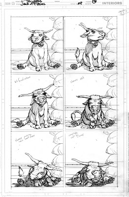

Costume change makes everything more interesting, no? I think Gary breaks a record in this issue.
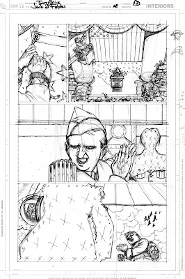

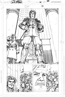
Jack is doing his best George C.Scott doing his best George S. Patton.
I have little extenders on his medal panel, thought maybe those would look a little more like roadside Kiwanis Club medallions than they did.

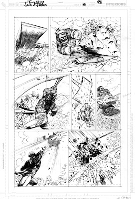
The guys HAD to have a goat here.

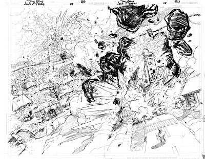

I love Gary clutching Jack's waist here.
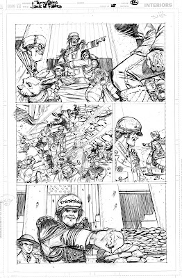
More art? Of course there's more art. But you won't see it here in this entry.
There's sketches and concept for crap all sorts of extry! But I'm tired. So look for more when I post for #29.
Thanks for reading the blog and for your comments!
Spread the word!
HAPPY NEW YEAR!
Hail, Fabledom!
h.e.


4 comments:
Happy new Year, Tony and I hope you had a lovely Christmas.
The goat so has to be there. Okay maybe a cow, no a goat was definitely the better choice.
Happy New Year and Marry belated Christmas.
Great Stuff for issue 28, and yeah, great last panel on page 15.
Can't wait to see more,
Peace.
Mello
Happy New Year and Marry belated Christmas!
Awesome work on those pencils for issue 28, and yes, the last panel on page 15 came out great.
Can't wait to see more!
Mello
Happy holidays from Val, Dakota and myself.
If I were you I'd watch out about becoming a better and better artist each year. if this keeps up you will vanish into the ether and become invisible to us, like an ant passing a swimming pool fool of people.
Please don't leave us behind.
Fred
Post a Comment