And WHO decided that this issue had to be TWENTY-FOUR pages instead of twenty-two? I look like Kiefer Sutherland?

See, this takes LOTS of practice. Lots.
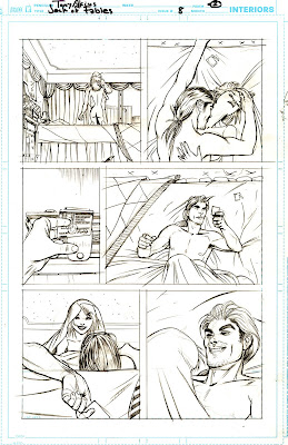
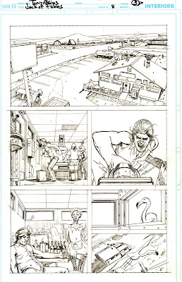


Panel Three? Yes. I'm a long-time ATHF fan. Chill out Boston!
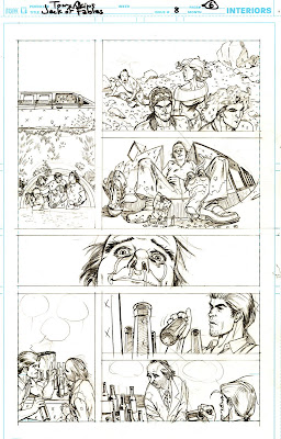


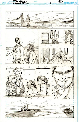
Matt and Bill requested a certain "type" for the gambler in this scene. But knowing the fate he was about to suffer I had to make him look like someone I know and have the need to torment even if it's only on paper. Cheers!


Do I LOOK like Mike Mignola?


OK, so panel six?..that was a complete "Rainman" moment for me.

Me bruhva were in plasteeks, 'ad to give i'up coz i'gives 'im th'rashies

"Ain't never gonna do it without my fez on!"
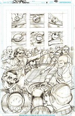

This is actually the SECOND version of this page. Everybody said I totally phucked-up trying to float this turd up the channel.

So I put a ribbon on it...What about this? No? O.K.

The final version; solved with a patch. If I had been a horse, they would have had to shoot me.

Iffen it's a bone in it?... we'll bust it up real good, yessir.

Note Jack breaking the "fourth wall" in panel 4. He's getting cheekier.
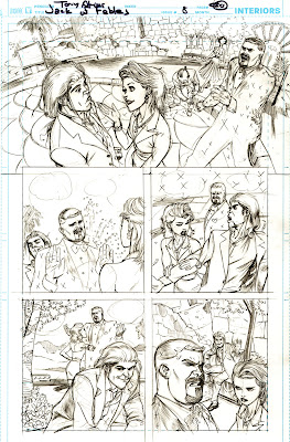
I want to add more sinew-pulling, I-beam crunching grimaces to the story, but all the Sturginghams ever sling my way are these subtle mugs,"Gary has a look like he's just tasted an Appletini when he was expecting a Lemondrop, you know what I mean"...Bang Zoom!
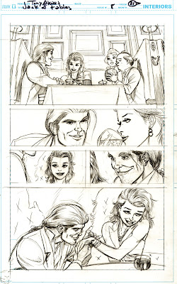
A lot of people really like this page. I was surprised at how it turned out as I'm so anxious about "montage" style narrative. But what I love about this page is Hollys look at the altar; god, she is so drunk and happy. Matt Sturges has dibs on this page so don't even try.


Here, in the original version of the page, the central female character was based on my friend Lena (see,"Besos It Goodbye" entry). But Editorial gave me the heads-up that Bill and Matt had an older woman in mind.

In order to make this demi-decapitation look convincing I had to perform one.


3 comments:
Ahhhh...the return of the Pencil Breakdowns. It has been too long since we had a set of these up. Still loving the book. Keep up the great work.
Love the Pencil breakdowns and the commentaries. I like the look of Holly's legs extending along side the page on the two earlier pages but the jaw-crushing is much better on the third version.
It's a good thing that you are so great at drawing crack.
Yes, that leg shot of Holly was the reason for that page. But it was not to be. Sigh.
I'm sure there will be plenty more crack to come.
Matt was telling me that that Jack is on the brink of becoming the second best title at Vertigo!
I blame you guys!
Post a Comment